Friday, February 25, 2011

The USI-waterboiler and Dishwasher

Today features two common household-appliances: a waterboiler and a dishwasher. Both were found in our department kitchen. I thought I'd add two items today, so you have something to ponder about during the weekend :)


Let's start with the dishwasher (click to enlarge). The main usability issue is that it has not just one, but two on/off buttons! The on/off button on the right has no directly discernible function. Pressing it seemingly only changes the state of the button (which can go in or out).

Only the left button, which has a symbol of a square with an 'I' in it, actually makes the machine do something (start cleaning)…


My guess is that the right on/off button actually puts the machine in or out of standby-mode and that the left button acts more like a 'start' button. After some experimentation, this seems to be the case.

Added to this, it's quite difficult to see if the right-most button is pressed or not.

Also, is there anybody who can tell me what the two cryptic symbols with the 3h-duration mean? (they're located near the right on/off button)


Now we proceed to the main dish of the day… The waterboiler!

I've grown to hate this machine. It's not that difficult to make a good waterboiler!!

First of all, sometimes it doesn't turn off automatically, which is dangerous. Secondly, the spout is shaped in such a way that boiling water easily overflows, which is also dangerous.

But the most absurd attraction of this devilish device is: only a tiny fraction of can be used! I've clarified it in the image above, the green arrow shows the usable part, while the red arrow shows the height of the total device. It's absurd! Even in nightmares you wouldn't dream up such a monstrosity :)


Solutions

The dishwasher has several issues: it uses non-common and unclear icons and it counter-intuitively sports two on/off-buttons. I think a redesign is necessary, but for now we might get away with some simple modifications: relabel the left on/off button to say "start" instead of an "I" with a square, reshape the right on/off button so that it is easier to see it's state (perhaps make it a switch) and change the weird symbol with two clocks saying "3h" to something meaningful (I have no clue what it means, so I can't suggest anything here).


Sadly (?), the waterboiler can't be saved. It has to go back to whence it came! I have seen over thirty examples of simple electric waterboilers that do work and the best solution is just to replace the current one with one of those.

Wednesday, February 23, 2011

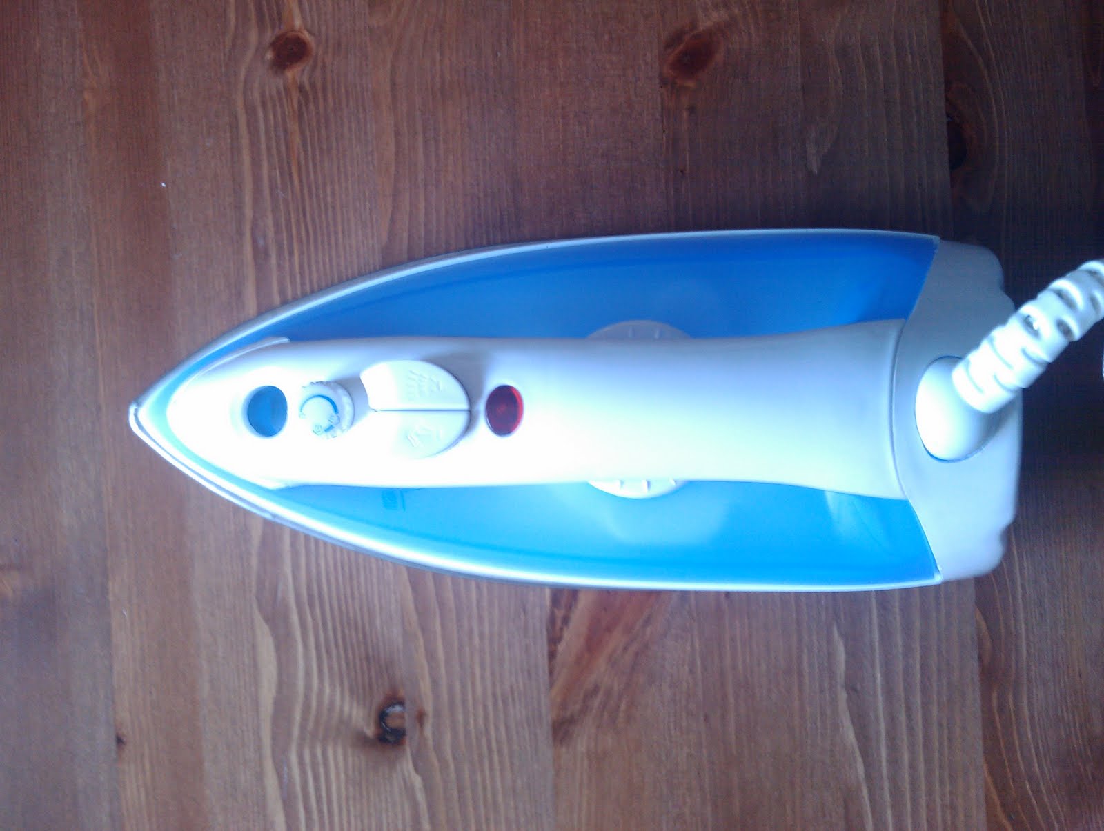
Ironing device from Hema


Another one from Daniel, thanks!


This device can be set to different settings with a dial underneath the handle.

The problem is that this dial can't be read when the device is used :) The above image shows the default (top) view, can you see at which temperature it's set?


Below is another view of the dial. For me (I have to admit I never use ironing devices), it's still difficult to see what is going on. It's set to 'min' right now, which is colder than 'max' of course :) But what does it mean to go to one, two or three dots?


Solution

Put the dial on top of the device. Also, could somebody used to ironing devices tell me whether an actual temperature instead of dots would be more helpful as well?

Monday, February 21, 2011

24 hour information machine


A finding from the other side of the globe, this one was sent to me from my brother in New Zealand. Thanks Remco!


What we see here is a '24h-touch screen information display'.


But it's locked inside the store and thus unusable…

What's more, it is turned on and asking to be touched :)

To me what adds to the fun is the dissonance between the happy font of the 'closed' sign, and the firm and decisive font which says "touchscreen: 24 hour". It's as if the 'closed' sign is laughing at us :)


As the solution is so blazingly obvious I've decided to leave it as an exercise to the readers :)

Friday, February 18, 2011

Refrigerators

Here is something I've always thought was strange about refrigerators: you set the power of them, not the temperature. Looking at the example up here (my Nordland refrigerator), you see it is set to '1' right now. But which temperature is associated with this?
The answer is that you can't know, it depends on the model, the outside temperature and the products placed inside.

Another thing is the operation of the dial: if you want the temperature to go up, the number should go down.
This number ranges from 0 to 7, which coincidentally is also the temperature-range most commonly used for a fridge (according to wikipedia). That makes this number even more confusing, as one might confuse refrigerator-power with temperature.
I've looked into many fridges and this is the same everywhere. Below you can find two examples from old manuals :)

AEG Arctis 0832-5I. Control 6 is for temperature, 7 shows a thermometer. What the others do, I have no idea :) Control 6 is also a beautifully weird design, for me it reads 4-1-2-3, I also have no clue why there is no dot between 3 and 4.


Sharp (dw37-41_OM) noticed that their control might be confusing and added the label 'Coldest', which is a (small) improvement.

Solution
Users don't want to set the refrigerator power, they think about the temperature. Change the system to be a thermostat, so that we can just set temperature as we're used to with heating systems!

Wednesday, February 16, 2011

Elevator at V&D

(thanks to Daniel for finding and photographing this)


For some reason elevators are a challenging system for designers, you can find the weirdest shapes and interaction designs.

The blog-item of today was found by my friend Daniel, at a large chain store in the Netherlands. As you can see in the photo, this elevator has two identical columns of buttons. Or does it only look like that?


As a matter of fact, the second column are only indicators, they can't be pressed. To make matters even more complicated, the actual buttons (the left column) also have a light in them. The buttons in the left column are only on when the lift is moving and the indicators in the right column are only on when the elevator is standing still.


It doesn't stop with the inside of the elevator, though! The buttons on the outside are maybe even more confusing. Here we see six buttons. Or do we? No, we get fooled again! :) The top two 'buttons' are actually indicators, showing if the elevator is going down or up. The third 'button' is also just an indicator, telling us if the elevator is out of service or not. The fourth and fifth 'things' are actually buttons, indicating 'up' and 'down'. The sixth and last thing is nothing at all, it's just there because these panels have six holes, probably… The bad thing about this is of course that the symbols up and down are more universal than the Dutch text and are a lot clearer. We'll probably never know why the designer thought this was a good idea :)


Solution

The solution is quite easy, we just remove all the indicators that look like buttons. The buttons can then show which floor the elevator is going to and we can use a simple LED-screen to show the current floor. Or if we want, we can keep a bit of the current design and just reshape the indicators so that they actually look like indicators instead of buttons, by modeling them as a light for instance. For the outside of the elevator, we can remove the 'op' and 'neer' buttons and use the first two buttons as actual buttons, with a light in them showing that they are pressed.

Monday, February 14, 2011

Smoking Pole

All Dutch trainstations are "smoke free", meaning that it is only allowed to smoke at certain designated areas. These areas are marked either with a yellow square painted around a small, covered hole or with a yellow circle painted around a 'smoking pole'. The pole in the image is an example of that, at the trainstation of Groningen.


It earned it's place on this blog, because of it's conflicting message. Normally these poles mean "smoke here" but this one has a sign stating that it is not allowed to smoke here! So what is the pole doing here?


The key is to know the pole's location; it's at the entrance of the translation. The idea being that you stop smoking here and discard your cigarette!

Of course, this is not what happens: people start smoking at these poles, creating a "smoke-screen" at the entrance of the station, which is the opposite of what this thing tries to reach!

Also, its prime functionality (discarding your cigarette in it) is not being used, as demonstrated by the cigarettes in the flower bed…


Solution

Actually, this is a rather tough one! We want to encourage people to discard their cigarette, but not to linger and smoke at this place. This goes against the common pattern I've observed with people putting out their cigarette: they do tend to linger around ashtrays.


One design change is to adjust the shape of this ashtray, so that it is physically different from a pole. We can combine this with the international non-smoking symbol, and an indication of the fine associated with continuing to smoke.

Friday, February 11, 2011

Bank mailbox


This is a rather confusing mailbox for a bank in the Netherlands. The top text states that for security reasons one should really not put payment transaction forms in "here", the bottom text says "here" is only for payment transaction forms (with arrows pointing upwards). The problem with this is that there only is one mailbox: the top one is bolted shut and thus looks like it is just a sign.

Solution
The two mailboxes serve a different purpose, one is an actual mailbox, the other a deposit for payment transaction forms. One of the possible solutions is to more clearly separate the mailboxes. For instance, put them on the same horizontal plane with some space in between. Or put the normal mailbox near the main door and the transaction-form mailbox near the payment machine, those might be more 'natural' locations.

Any other suggestions?